 Newshot
When I started designing websites thirty years ago, David Siegel had just published Creating Killer Web Sites, the book that popularised HTML tables and spacer GIFs for laying out web pages. CSS eventually gave us more control over layouts through floats and positioning. Neither was intended for page layout, and inconsistent browser behaviour could make using them frustrating. Still, that didn’t stop me and a generation of other designers from using floats and positioning.
When CSS frameworks began providing ready-made grid systems, things got a little easier. Blueprint CSS) offered a 24-column grid, while Nathan Smith’s 960 Grid System offered 12- and 16-column options. These frameworks gave designers and developers a shared structure, making layout planning and implementation considerably easier.
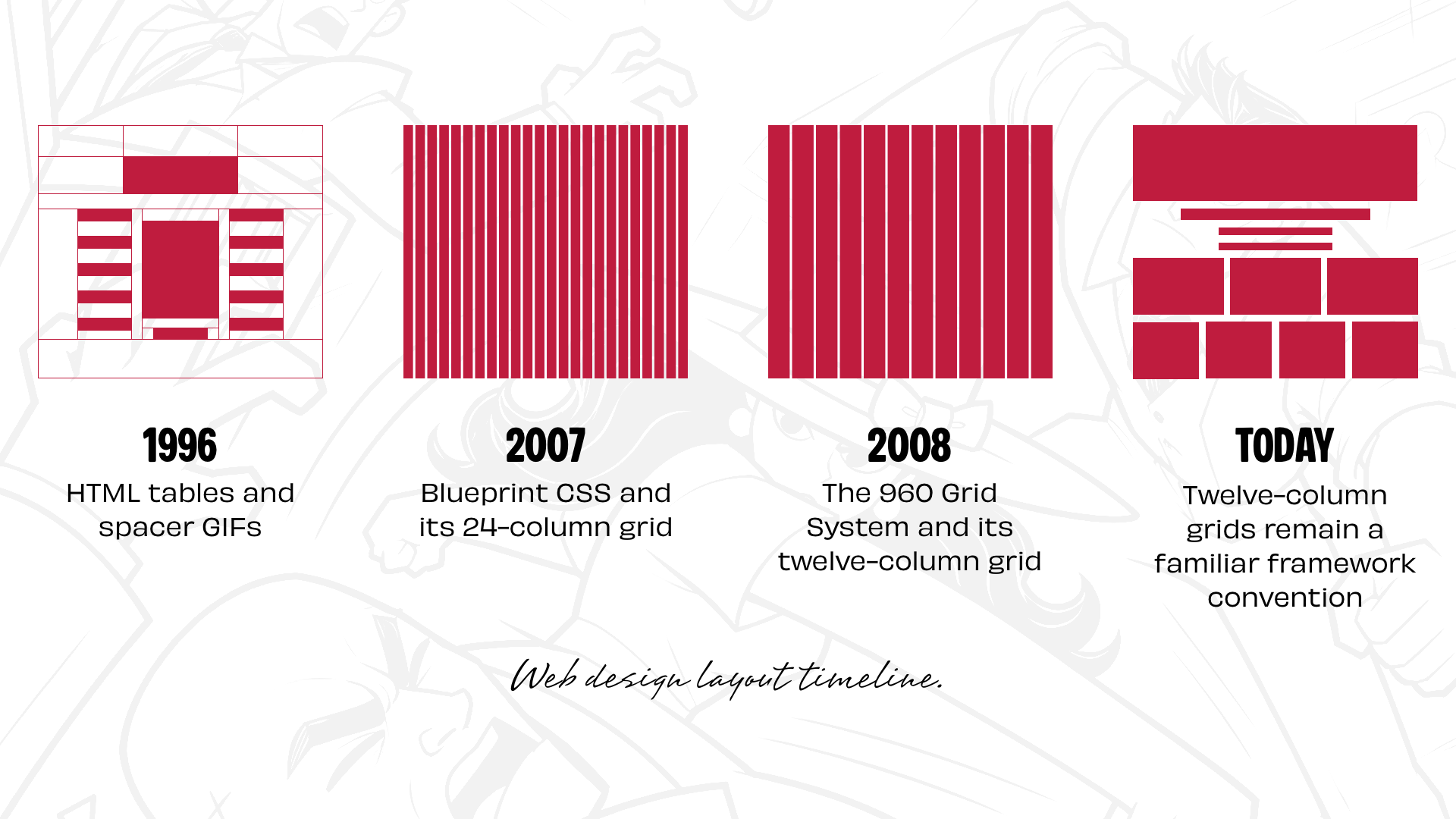
- 1996: HTML tables and spacer GIFs
- 2007: Blueprint CSS and its 24-column grid
- 2008: The 960 Grid System and its twelve-column grid
- Today: Twelve-column grids remain a familiar framework convention.
Twelve-column grids weren’t invented in the 2000s. Graphic designers had used column-based and modular grids for decades, and twelve is a convenient number because you don’t need to be a maths genius to divide it into halves, thirds, and quarters to create the 2-up, 3-up, and 4-up components we see everywhere online.
Frameworks like Bootstrap and Foundation followed, helping establish twelve-column grids as the de facto standard for page layouts. I get why that happened. But somewhere along the way, one layout option became the default starting point for almost everything.
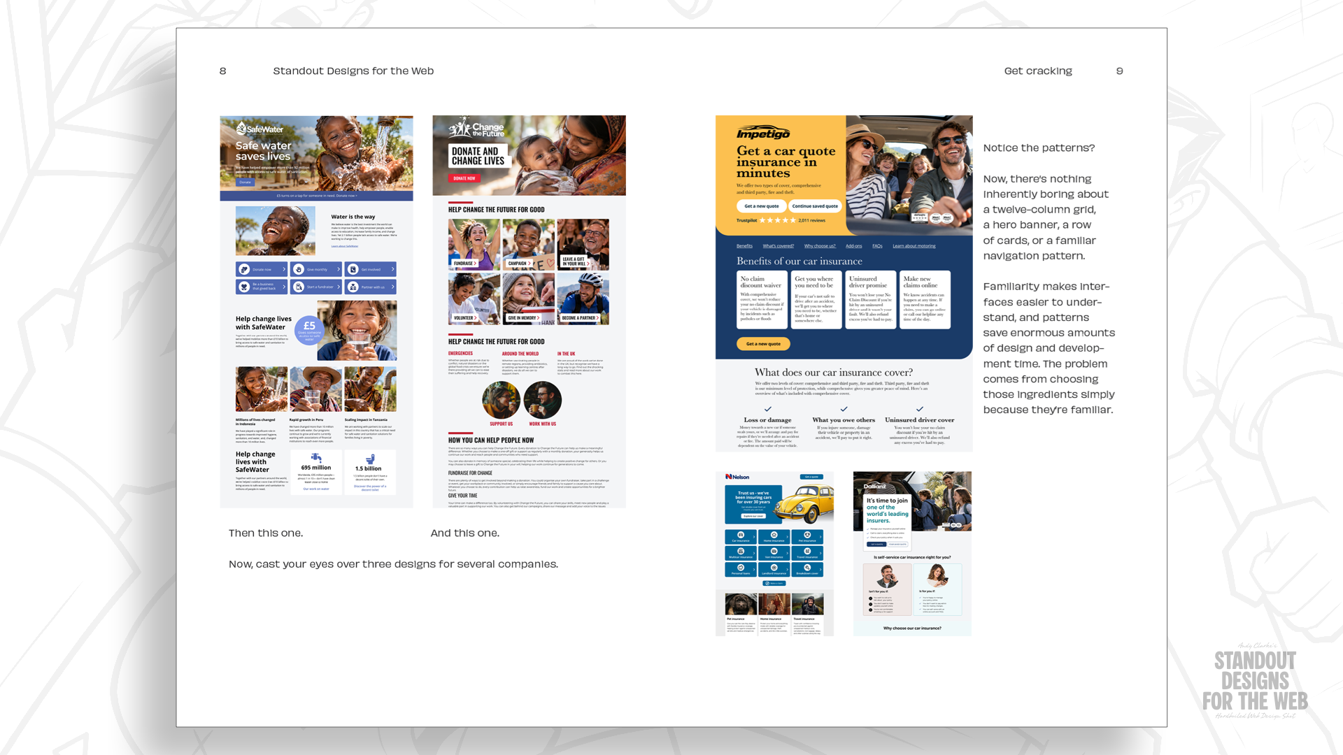
CSS Grid changed what’s possible for page layouts, but I still see designers start by dividing a page into twelve equal columns, then deciding how to fit their content into them. The designs they end up with might be perfectly fine, but they can also look remarkably similar.
Still, I don’t think twelve-column grids themselves are the problem. It’s reaching for a familiar solution before considering what makes the company I’m designing for distinctive and what its website needs to communicate. So what happens when I start with those questions instead?
Every company has a story worth telling
Before I decide how many columns a layout needs, I want to understand the company I’m designing for. What makes it different from its competitors? What does it want people to remember? Does it have a personality that could influence how its website looks and feels?
These questions matter because a layout does more than arrange content. The size, position, and relationships between elements influence how people experience a website. A restrained, orderly composition can communicate something very different from one that’s full of energy and movement. So to demonstrate what I mean, I’ll use Wheelman. It’s a fictional company I invented for my book, Standout Designs for the Web.
Pre-orders for Standout Designs for the Web are now open in the CSS-Tricks store.
Wheelman provides products and services for getaway drivers, including legal advice, robbery insurance, and an online shop selling break-in essentials. It also publishes a magazine with advice, news, and stories about life behind the wheel.
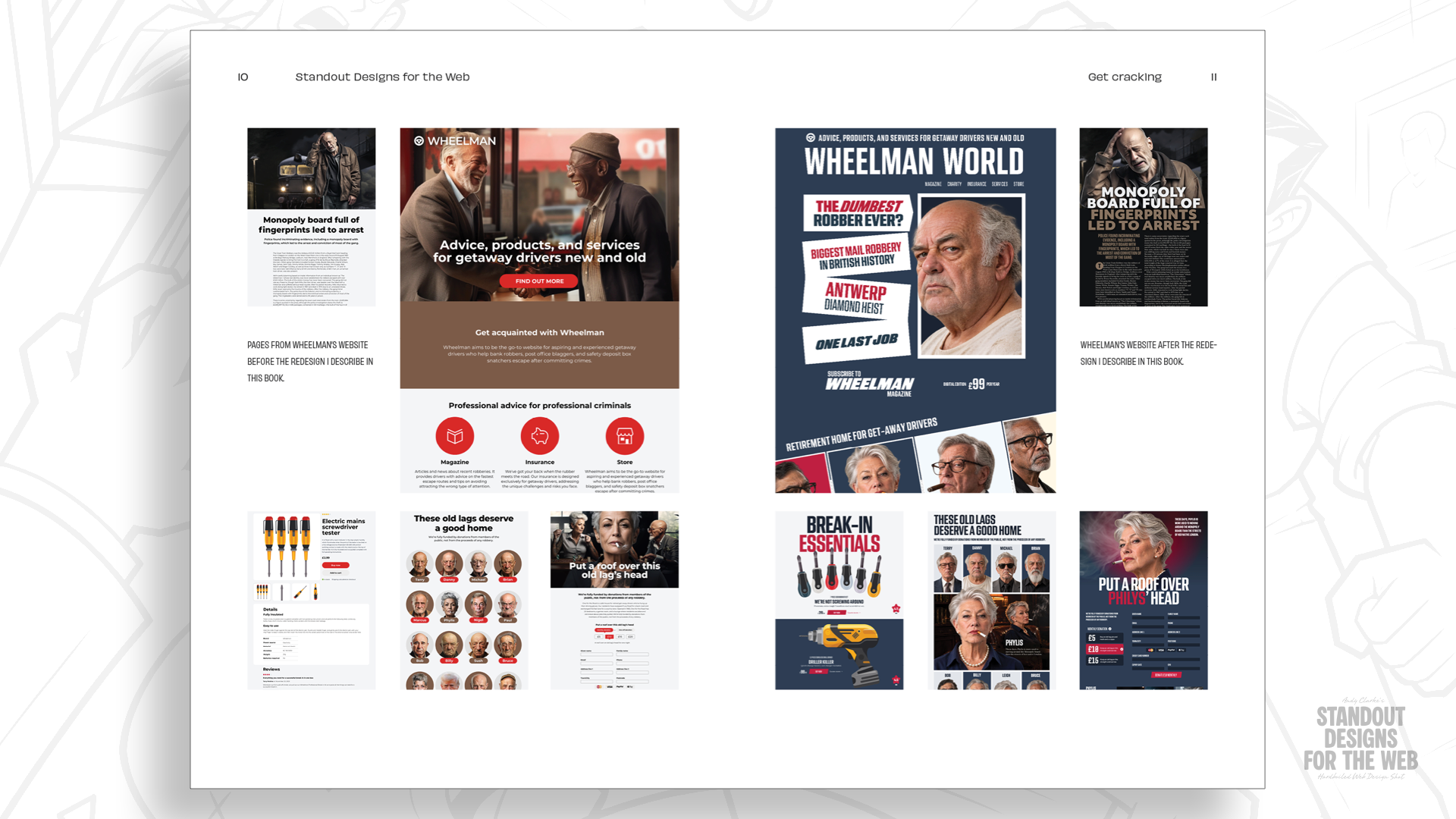
Wheelman isn’t an ordinary company, so why should its website look like an everyday collection of components? It takes its business seriously, but isn’t afraid to have fun with its design. It’s rebellious, but doesn’t want to look off-putting. Its audience is criminals, but they demand professionalism. Wheelman has plenty of personality to work with, and I want its designs to reflect that.
That doesn’t mean making Wheelman different for difference’s sake. Its customers still need to find what they’re looking for, understand what it provides, and buy its products and services. But I can make those experiences more memorable by choosing layouts that fit the company, rather than settling for familiar arrangements.
Starting with content, not columns
Let’s imagine I’m designing a new landing page for Wheelman’s online shop. It includes two products, one with a gigantic headline, product images, and the type of functionality and information you’ll find on most stores.
Before I decide how to arrange these elements, I want to look beyond them and consider how they relate. I ask myself questions like:
- Which elements deserve the most attention?
- What belongs together?
- Is there a natural order to the information?
Only then do I start thinking about visual design questions: “Would a large photograph set the scene? Should I make the introduction more prominent? Can whitespace lead the eye and create spaces to pause? How can I bring images and text together into a considered composition?”
These questions help me understand what the layout needs to accomplish before I decide which grid might help me achieve it.
I could arrange everything in a single column for a straightforward reading experience. That would make responsive design considerably easier. But I won’t.
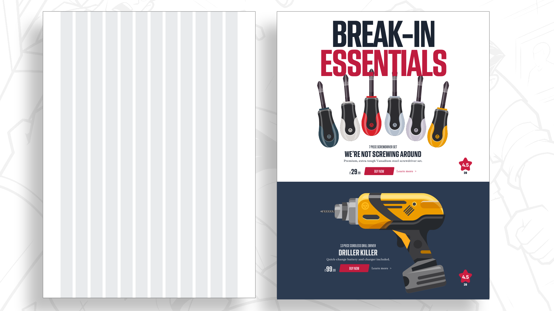
Wheelman has a rebellious personality, and I want its shop to reflect that. A more energetic layout seems appropriate, but I still need to establish a clear hierarchy between the products and their information. Two equal-width columns give both products equal prominence.
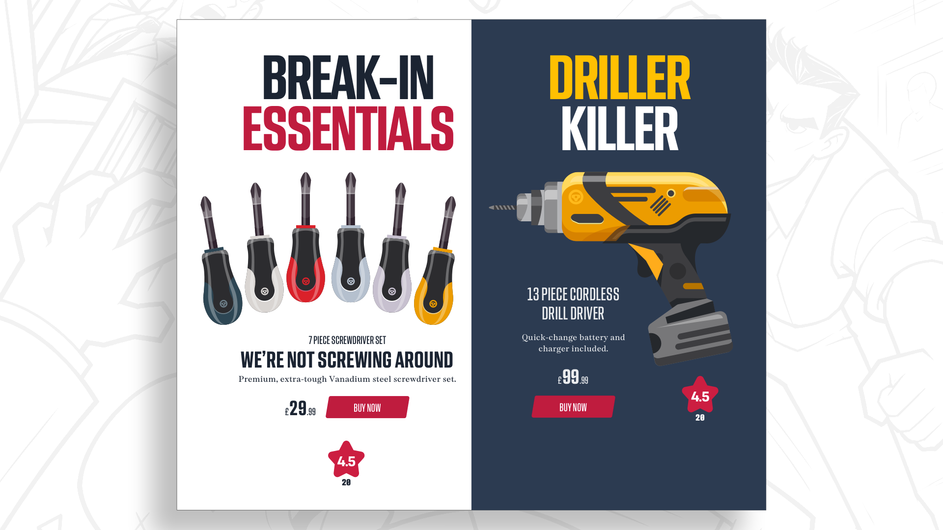
Changing their proportions creates a hierarchy, even when most elements stay the same size.
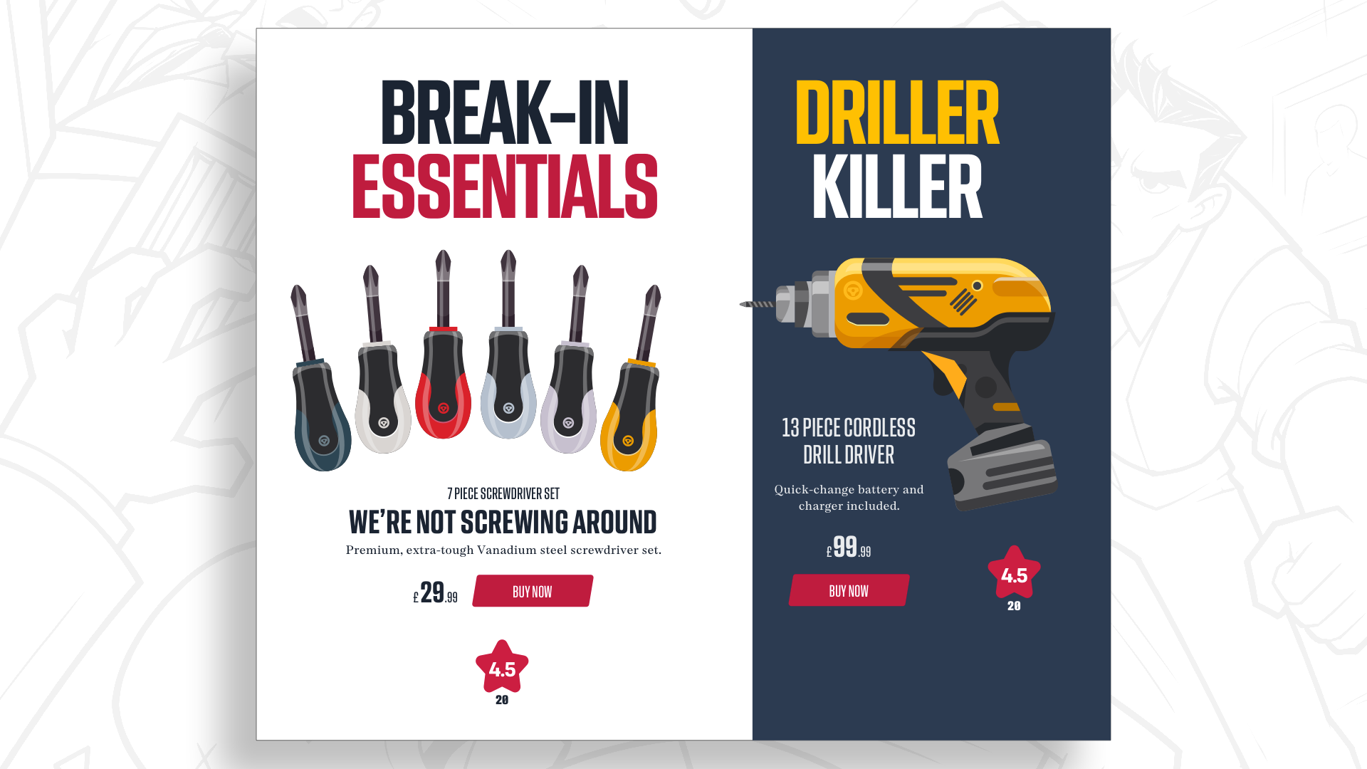
I could base those proportions on a twelve-column grid, but I won’t. Columns only divide space vertically, and I want a layout that adds another dimension.
Adding another dimension with modular grids
Dividing a layout into columns is a useful starting point, but adding rows creates another dimension and opens up more creative possibilities. Where columns and rows intersect, they form rectangular or square units called modules.
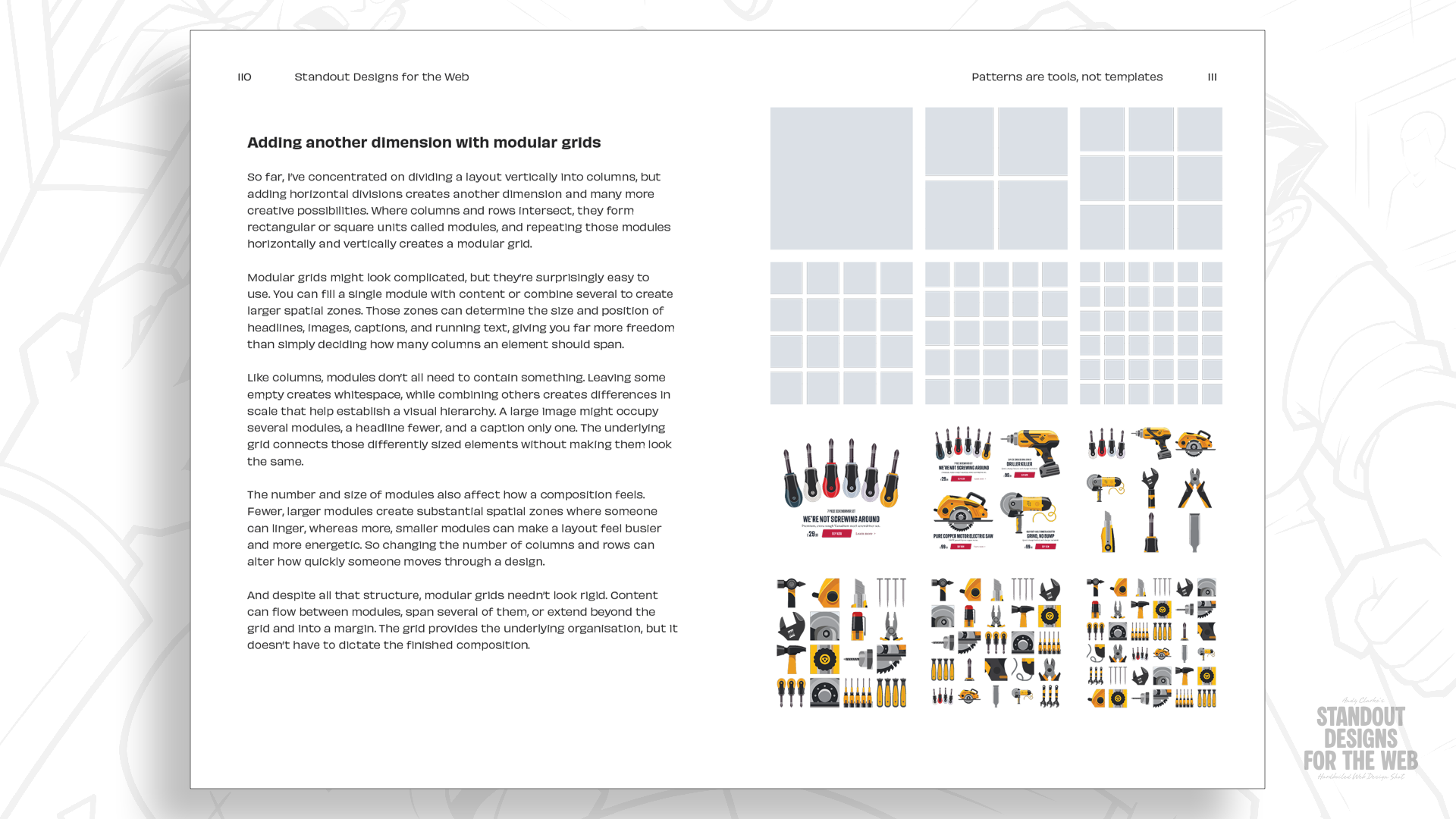
Combining these modules creates larger spatial zones that can establish hierarchy, control whitespace, and add variety to a composition.
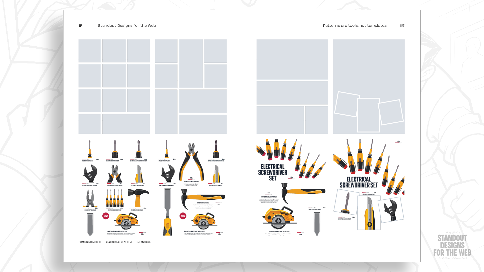
Using a modular grid, I can add drama, establish hierarchy by varying scale, and make the composition feel far less predictable. Starting with four columns and four rows gives me sixteen modules to work with, but I don’t need to fill them all.
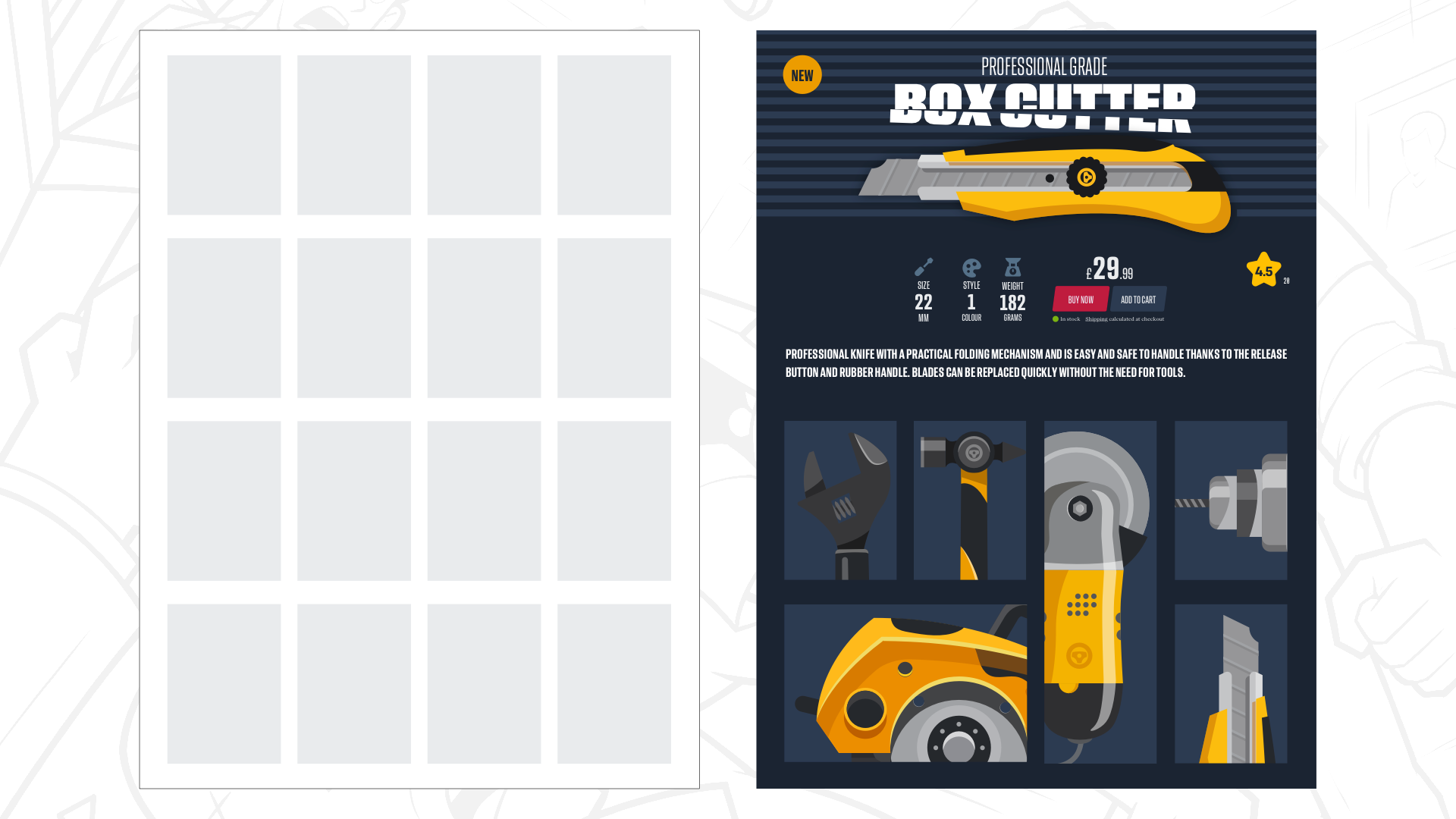
I can create drama by spreading the large graphic headline and product image across four modules, while the product information and shopping tools occupy one module each.
The modular structure becomes even more apparent in the grid of alternative products. Most occupy just one module, while others fill two, either horizontally or vertically. Varying their sizes gives some products more prominence and makes the overall arrangement feel less predictable.
The result still feels like a product page, with a clear reading order and space for the content to breathe. But it also feels unmistakably like something Wheelman would publish.
I don’t expect this composition to work at every screen size, so I can adjust the size and quantity of modules to improve the reading experience.
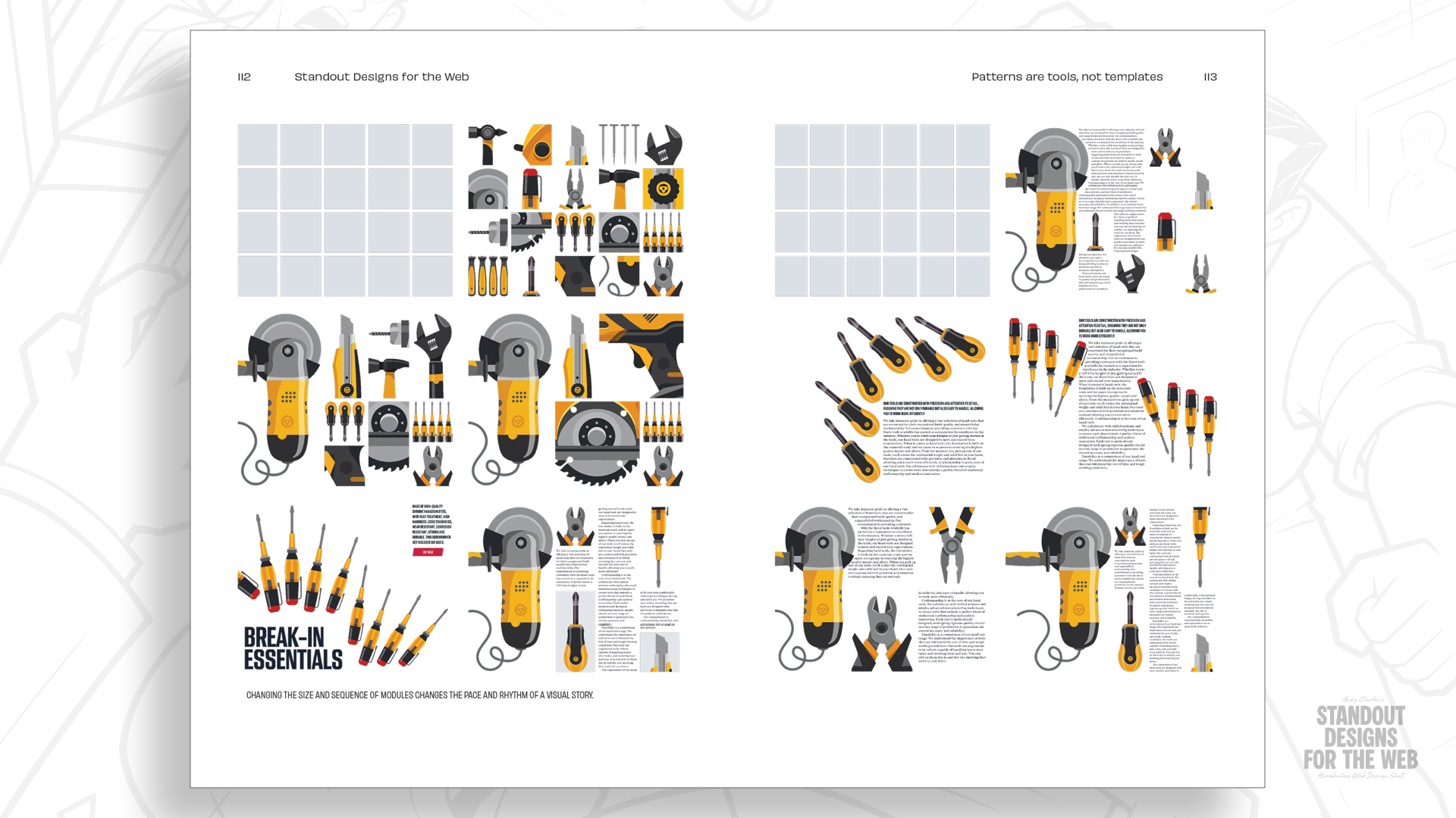
And if one grid offers this much flexibility, imagine what combining two or more grids can do.
Mixing grids to create compound layouts
One thing I want from Wheelman’s website is variety. Its magazine, shop, and services serve different purposes, and I don’t want every page to feel like I’ve poured its content into the same template.
Wheelman needs layouts which feel organised without being predictable. Compound grids give me the structure I need while leaving room for less conventional arrangements.
A compound grid combines two or more grids of any type — column, modular, or hierarchical — on the same page. These grids can overlap, sit side by side, or be stacked one on top of the other. Combining grids creates possibilities which neither grid offers on its own.
I can start by overlaying a two-column grid with one containing three columns. Their combined grid lines create four columns of two different widths, giving me more flexibility without losing the underlying structure.
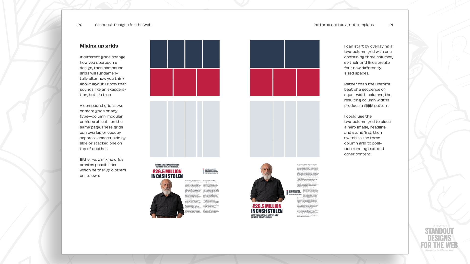
Those proportions offer more possibilities for arranging content. I might use a wider area for a photograph or headline, then place a pullquote into one of the narrower spaces. Another page could use the same underlying grid but combine its spaces differently to suit another story.
Combining grids with different column counts gets even more interesting as those numbers increase. In Standout Designs for the Web, I explore several combinations, including mixing four- and five-column grids to create different compositions for Wheelman’s pages while maintaining a connected visual structure.
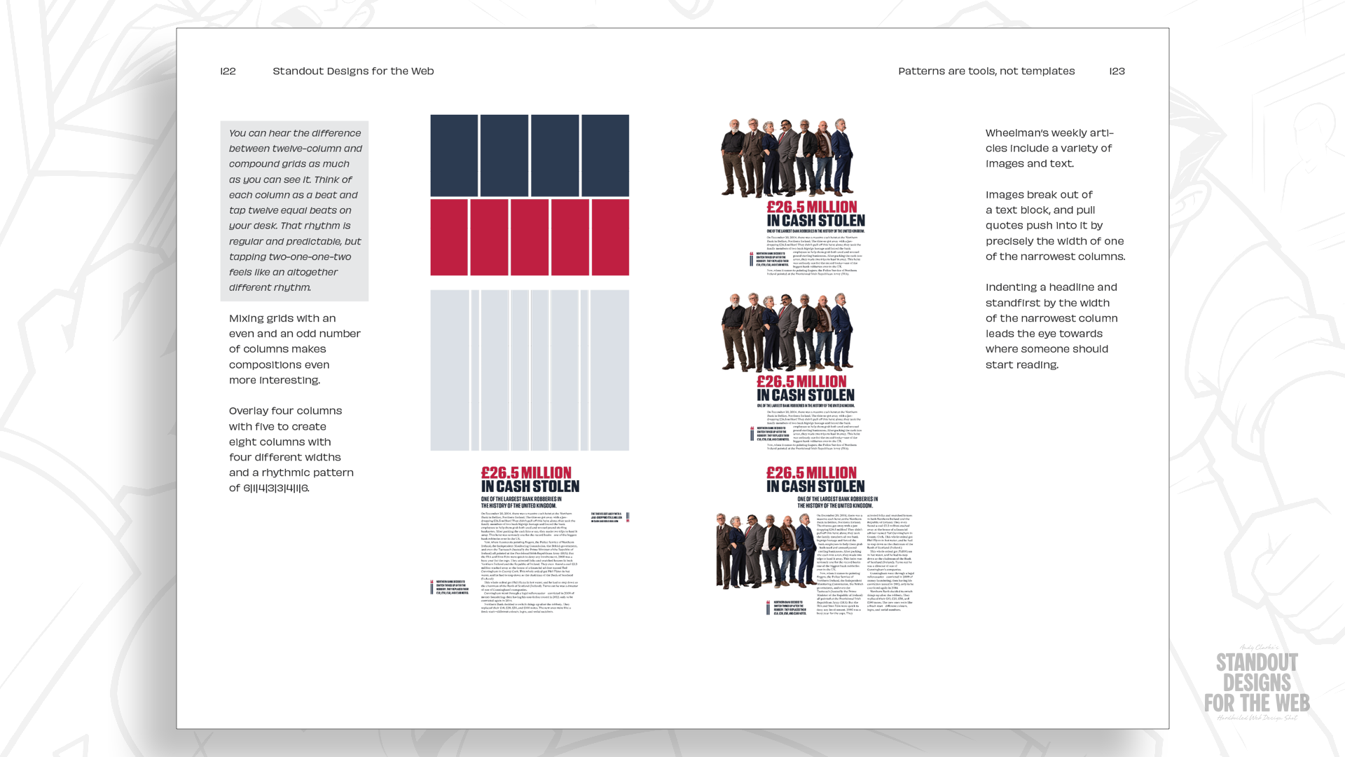
The point isn’t to make every page look different for its own sake. It’s to give each section a layout that suits its content while keeping them all feeling like part of the same company.
Don’t let familiarity make choices for you
Twelve-column grids are useful, and I’m certainly not suggesting you should stop using them entirely. But they’re only one option among many, and starting every design with the same structure limits your possibilities before you’ve even considered the story your design is telling.
There’s also nothing inherently wrong with the 2-up, 3-up, and 4-up patterns a twelve-column grid inspires. They can sometimes be exactly what’s needed. But reaching for them automatically can leave little room for the character and personality that make websites memorable.
Wheelman gives me plenty of reasons to choose different layouts. Its stories, products, and services don’t all need the same arrangements, and its personality gives me opportunities to make those arrangements more distinctive. The grids are simply tools that help me put those ideas into practice.
And this applies to much more than layout. The same thinking should influence the colours I choose, the typography I use, the images I commission, and the way I bring those elements together.
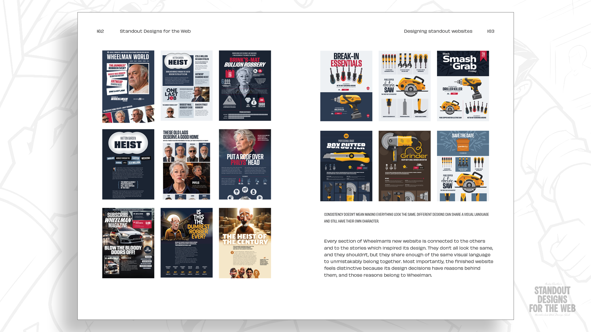
That’s why I wrote Standout Designs for the Web. I want to encourage designers to look beyond familiar solutions and make more deliberate decisions about colour, typography, imagery, and layout. Not to be different for difference’s sake, but to create websites that look and feel like they belong to the companies behind them. And no one else.
Pre-orders for Standout Designs for the Web are open! Everyone who pre-orders will also receive the Hardboiled Client Interview Guide for free — a practical companion to help designers ask better questions and discover what makes a company distinctive.
The book will be published on November 20, priced at $14.99 for the DRM-free EPUB and PDF editions.